

Somehow the Grids Layout Builder for Gutenberg ist not pushing styles to the footer within a Timber theme. At least not for me.
Somehow the wp_footer action within the Grids plugin is not being executed and no grid styles are added to the footer. I am not getting any errors, but will have to investigate some more in the near future ;)
Update: It is related to the get_footer action within Grids. get_footer is used to load the appropriate footer template file, which I am not using in my Timber theme ;) So the workaround below is perfect.
Here a quick workaround for the theme functions.php, that does the trick for now.
|
1 2 3 4 5 |
add_action( 'wp_footer', function(){ if(class_exists('Grids\Core')){ echo Grids\Core::instance()->styles(); } }, 100 ); |
“A layout builder is a tool that helps you creating visual structures in your page, from a simple layout made by adjacent columns, to more complex compositions.
Grids is entirely based on the WordPress block editor, which means that you’ll be able to use it together with the myriad of content blocks that developers and designers from all around the World are creating.
With Grids, we’re bringing a visual structure to the content written with the WordPress Block Editor.”
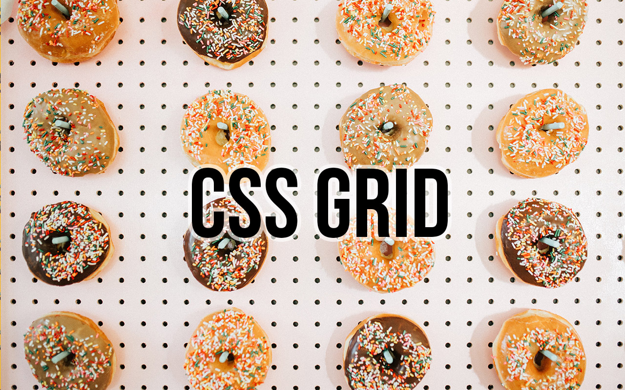
Grids: Layout builder for WordPress / Documentation / CSS-Tricks Article / A Complete Guide to Grid
This is using the Grids Plugin and only took a couple of minutes! I am so glad IE 11 is soon completely unsupported ;) and we can start using CSS Grid freely. Well we can, as nobody should be using IE 11 anymore!!!
On mobile its just stacked rows :)
COLUMN 1
I love to solve puzzles and find epic solutions :)
CSS Grid Layout excels at dividing a page into major regions or defining the relationship in terms of size, position, and layer, between parts of a control built from HTML primitives.
Like tables, grid layout enables an author to align elements into columns and rows. However, many more layouts are either possible or easier with CSS grid than they were with tables.
COLUMN 2
We all love magazine-style layouts and we are getting closer to getting that :) The magic is in the detail.
For example, a grid container’s child elements could position themselves so they actually overlap another layer, similar to CSS positioned elements.
FLEX OR GRID
The basic difference between CSS Grid Layout and CSS Flexbox Layout is that flexbox was designed for layout in one dimension – either a row or a column.
Grid was designed for two-dimensional layout – rows, and columns at the same time.
COLUMN 3
I only styled the Desktop size, as a little preview. Added Custom CSS to switch areas for tablet sizes.
Unidentified vessel travelling at sub warp speed, bearing 235.7. Fluctuations in energy readings from it, Captain. All transporters off. A strange set-up, but I’d say the graviton generator is depolarized.
The dark colourings of the scrapes are the leavings of natural rubber, a type of non-conductive sole used by researchers experimenting with electricity. The molecules must have been partly de-phased by the anyon beam.
Lucas ipsum dolor sit amet c-3po solo bothan qui-gon darth solo darth dantooine dagobah mustafar. Fett solo yoda r2-d2 kit obi-wan hutt amidala kenobi. Jade leia gonk lobot ahsoka darth jade skywalker organa. Utapau mara owen darth darth yavin.
Lando baba wedge darth solo skywalker ben fett. Fisto wookiee bothan antilles antilles luke kenobi. Yavin naboo kenobi jinn calamari antilles. Organa jabba skywalker gamorrean ackbar. Windu skywalker kit skywalker. Dantooine dantooine moff leia dantooine wicket amidala.
This is almost a perfect Gutenberg plugin and a reduced / simplified integration of CSS grid. I really think that this plugin makes Gutenberg 1000times better.
There is so much repetition of Gutenberg blocks out there, while this really addresses something new and nails it :)
There are still things missing, that are critical and would make this even more useful for certain websites:


I am a full-stack developer. My expertise include:
I love programming, design and know my way around server architecture as well. I would never feel complete, with one of these missing.
I have a broad range of interests, that’s why I constantly dive into new technologies and expand my knowledge where ever required. Technologies are evolving fast and I enjoy using the latest.
Apart from that, I am a peace loving guy who tries to have people around him that think the same. I truly believe in the principle: “If you help someone, someone will help you, when you need it."