

Elementor Pro provides grid containers as an experimental feature. The options provided are limited, when it comes to native controls. The fine-tuning of the grid container items need to be done using Advanced CSS.
If you are looking for a simpler way without using Advanced CSS, I started building out a Grid Tweaker for Elementor.


This will add a new tab to all containers and allows you to tweak grid-row / grid-column. Basic work is done. I am currently tweaking the controls a bit and will make it even easier ;)
Added an example template to import into Elementor. For those interested, the plugin can be freely downloaded from my Github repository. You can also do a search for “cubicfusion-grid-tweaker” on Github.
Cheers and enjoy
Alex

I had the chance this year to meetup with my client Thomas Dowson from “Archaeology Travel Media” at the Travel Innovation Summit in Seville.
Over the past 2 years we have been revamping all the content from archaeology-travel.com and integrated a sophisticated travel itinerary builder system into the mix. We are almost feature complete and are currently fine-tuning the system. New explorers are welcome to signup and testdrive our set of unique features.
It was so nice to finally meet the whole team in person and celebrate what we have accomplished together so far.
Directly taken from the front-page :)
“EXPLORE THE WORLD’S PASTS WITH ARCHAEOLOGY TRAVEL GUIDES, CRAFTED BY EXPERIENCED ARCHAEOLOGISTS & HISTORIANS
Whatever your preferred style of travel, budget or luxury, backpacker or hand luggage only, slow or adventure, if you are interested in archaeology, history and art this is an online travel guide just for you.
Here you will find ideas for where to go, what sites, monuments, museums and art galleries to see, as well as information and tips on how to get there and what tickets to buy.
Our destination and thematic guides are designed to assist you to find and/or create adventures in archaeology and history that suit you, be it a bucket list trip or visiting a hidden gem nearby.”
More Details
About
Mission & Vision
Code of Ethics
We are constantly expanding our set of curated destinations, locations and POIs. Our plan is it, to make it even easier to find unique places for your next travel experience.
We are also working on partnerships to enhance travel options and offer a even broader variety of additional content.
Looking forward to all the things to come, as well as to the continued exceptional collaboration between all team members.

“Klaro [klɛro] is a simple consent management platform (CMP) and privacy tool that helps you to be transparent about the third-party applications on your website. It is designed to be extremely simple, intuitive and easy to use while allowing you to be compliant with all relevant regulations (notably GDPR and ePrivacy).”
The tool is developed by KIPROTECT and can be found on Github.
As I integrated Klaro on a couple of websites so far, I decided to make my work a bit easier and start building some basic clean themes for it.
I have a basic white and black&white theme so far. The download includes a testdrive folder, to showcase the themes. The white theme is also used on this website ;)
I really hate those standard consent management modals, that integrate badly into the website native design.
Klaro does a good job allowing to override its core theme and makes it a bit more pleasant. We do have to live with those modals from now on ;)
The themes are Sass-based and provide easy configuration options.
Enjoy!
cubicFUSION Themes for Klaro! @ Github
Klaro is still missing some things, will collect some workarounds here for you to play with.
Updates: Github Discussion
– 0.7.10 also adds custom callbacks to services (onAccept, onDecline, onInit) NICE!
Used a simple MutationObserver to do some magic for now, without diving into the core Klaro code for now. I am sure they already have an event listener or watcher setup.
|
1 2 3 4 5 6 7 8 9 10 11 12 13 14 15 16 17 18 19 20 21 22 23 24 25 26 27 28 29 30 |
var cm_event = document.createEvent('Event'); cm_event.initEvent('consentModalOpen', true, true); document.addEventListener('consentModalOpen', function (e) { console.log("consentModalOpen") }, false); document.addEventListener("DOMContentLoaded", function(e) { var cm_target = document.getElementById( "klaro" ), cm_visible = false; var observer = new MutationObserver(function(mutationRecords) { if(document.querySelectorAll('#klaro .cookie-modal').length > 0 && cm_visible == false){ cm_visible = true; document.dispatchEvent(cm_event); }else{ cm_visible = false; } }); observer.observe(cm_target, { childList: true, subtree: true, characterDataOldValue: true }); }); |

Visbug is an amazing new browser extension that allows you to do a visual inspection of your website in development.
A really nice tool for designers & content creators, helping them to optimize the look and feel of a website.
The extension is currently available for Chrome, but a Firefox Addon is in development.

After some downtime, GreenApe is breathing again. I revived the brand with a good friend of mine and we will be reopening shop options shortly.
Michael and I have been friends for a long time. We have been working on many different projects over the years.
He launched GreenApe in 2011 and I helped him with his first steps. A couple of months ago we decided to merge our competences and expand what GreenApe offers and stands for.
From the website: “The GreenApe brand was established in 2011. GreenApe’s career began with the 1st Single Malt Whisky Coffee.
As the first of its kind, our coffee is refined with Original Single Malt Whisky. To this day, he pampers many connoisseurs and gourmets with his unique taste. Now there is another reason to rejoice.
From now on, we are continuously expanding the GreenApe product world with several stylish gadgets and useful accessories. For you this means that you will be able to discover even more beautiful, special or practical things in the future.“
GreenApe is all about lifestyle & leisure products, fun gadgets and unique food & drinks.


“Element queries are a new way of thinking about responsive web design where the responsive conditions apply to elements on the page instead of the width or height of the browser.
Unlike CSS @media queries, @element Queries are aware of more than just the width and height of the browser, you can write responsive conditions for a number of different situations like how many characters of text or child elements an element contains.
Another concept that element queries brings to CSS is the idea of ‘scoping’ your styles to one element in the same way that JavaScript functions define a new scope for the variables they contain.”
min-width min-width in px, min-width in %max-width max-width in px, max-width in %min-height min-height in px, min-height in %max-height max-height in px, max-height in %min-characters on block elements, on form inputsmax-characters on block elements, on form inputsmin-lines min-lines demomax-lines max-lines demomin-children min-children demomax-children max-children demomin-scroll-y min-scroll-y demomax-scroll-y max-scroll-y demomin-scroll-x min-scroll-x demomax-scroll-x max-scroll-x demoorientation orientation demomin-aspect-ratio min-aspect-ratio demomax-aspect-ratio max-aspect-ratio demo$this $this demo$parent $parent demo$root $root demo$prev $prev demo$next $next demo
And another website dealing with Flexbox patterns.
“Flexbox is awesome, but it introduces many new concepts that can make it difficult to use. These interactive examples will show you practical ways to use it to build UI components. They start out simple and get more complex near the end. You can start using these patterns in your own code right away, though I recommend you apply accessibility best practices to the markup (like using semantic HTML5 elements).”
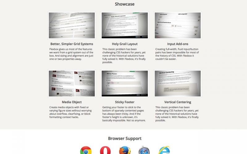
Solved by Flexbox is not framework, but a website that showcases how Flexbox makes many CSS hacks obsolete.
“This site is not another CSS framework. Instead, its purpose is to showcase problems once hard or impossible to solve with CSS alone, now made trivially easy with Flexbox. And with the recent release of Internet Explorer 11 and Safari 6.1, the latest Flexbox spec is now supported in every modern browser.”

Flexbox is here to stay and its time to start using it. Flexbox has more than 95% support globally, which matches support for calc and viewport units. Bootstrap 4 will be supporting it and my new website will be Flexbox based as well :)
Oh and if you need older browser support … use Flexibility.
Bulma is a modern CSS framework based on Flexbox. It provides a nice set of core functionality and almost every kind component you might need to build a quick skeleton for your project.