is a fast and simple web font loader. You can use it to load fonts and customise your browser’s font loading behaviour.
Font Face Observer gives you control over web font loading using a simple promise based interface. It doesn’t matter where your fonts come from: host them yourself, or use a web font service such as Google Fonts, Adobe Typekit, Fonts.com and Webtype.
|
1 2 3 4 5 6 7 8 9 |
var font = new FontFaceObserver('My Family', { weight: 400 }); font.load().then(function () { console.log('Font is available'); }, function () { console.log('Font is not available'); }); |

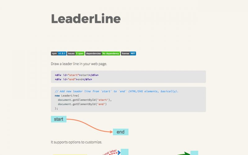
Quickly draw a leader line in your web page.
|
1 2 |
<div id="start">start</div> <div id="end">end</div> |
|
1 2 3 4 5 |
// Add new leader line from `start` to `end` (HTML/SVG elements, basically). new LeaderLine( document.getElementById('start'), document.getElementById('end') ); |

CSS responsive grid of hexagons allows you to easily create just that for images and some text. Nice way to present a portfolio.
#hexGrid)

Hamburgers is a collection of tasty CSS-animated hamburger icons. Also included is the source as a Sass library. It’s modular and customizable, so cook up your own hamburger.
|
1 2 3 4 5 6 7 |
<link href="dist/hamburgers.css" rel="stylesheet"> <button class="hamburger hamburger--collapse" type="button"> <span class="hamburger-box"> <span class="hamburger-inner"></span> </span> </button> |

Snap.svg Animator is an open sourced plugin for Animate CC that exports animations for the web rendered in SVG.
It uses the Snap.svg JavaScript library to dynamically draw SVG content at runtime. Snap.svg is a JavaScript library created by Dmitry Baranovskiy, who also created Raphaël.js.
A simple API allows you to write and manipulate SVG content in the browser.

“Element queries are a new way of thinking about responsive web design where the responsive conditions apply to elements on the page instead of the width or height of the browser.
Unlike CSS @media queries, @element Queries are aware of more than just the width and height of the browser, you can write responsive conditions for a number of different situations like how many characters of text or child elements an element contains.
Another concept that element queries brings to CSS is the idea of ‘scoping’ your styles to one element in the same way that JavaScript functions define a new scope for the variables they contain.”
min-width min-width in px, min-width in %max-width max-width in px, max-width in %min-height min-height in px, min-height in %max-height max-height in px, max-height in %min-characters on block elements, on form inputsmax-characters on block elements, on form inputsmin-lines min-lines demomax-lines max-lines demomin-children min-children demomax-children max-children demomin-scroll-y min-scroll-y demomax-scroll-y max-scroll-y demomin-scroll-x min-scroll-x demomax-scroll-x max-scroll-x demoorientation orientation demomin-aspect-ratio min-aspect-ratio demomax-aspect-ratio max-aspect-ratio demo$this $this demo$parent $parent demo$root $root demo$prev $prev demo$next $next demo
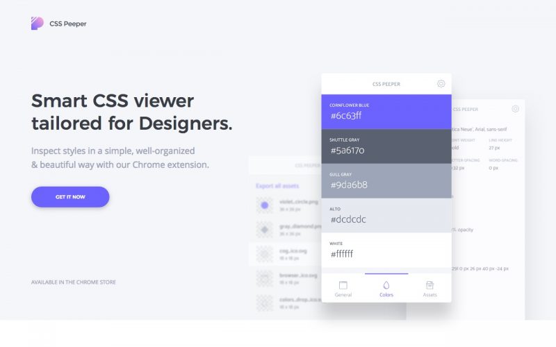
Inspect styles in a simple, well-organized & beautiful way with this Chrome extension. You can select any object to get more specific information about them. Also a nice way to browse color palettes of websites you visit.

Rocket.Chat is am impressive Open Source Web Chat Platform, with a huge amount of features: