
Artificial intelligence (AI) has revolutionized the way we interact with images, and the current AI image solutions are a testament to this. AI image solutions are applications of AI that can identify, classify, and manipulate images with remarkable accuracy and speed. With the rise of deep learning and computer vision, AI image solutions have become increasingly sophisticated, and their applications have expanded to fields such as healthcare, finance, entertainment, and more. Some of the most prominent AI image solutions and their applications.
Image recognition is the process of identifying and classifying objects, people, or other elements in an image. AI-powered image recognition solutions use deep learning algorithms to recognize images with high accuracy. Image recognition is widely used in various fields, including healthcare, security, and retail. For example, in healthcare, AI image solutions are used to analyze medical images such as X-rays and MRIs to detect diseases and conditions such as cancer, brain injuries, and more. In security, AI-powered image recognition solutions are used to identify faces, license plates, and other elements in surveillance videos. In retail, AI image solutions are used to identify and classify products and improve inventory management.
Object detection is a subset of image recognition that involves detecting the location of specific objects in an image. AI-powered object detection solutions can identify and locate objects in an image with high accuracy. Object detection is used in various fields, including self-driving cars, security, and e-commerce. For example, in self-driving cars, AI image solutions are used to detect pedestrians, traffic lights, and other objects on the road. In security, AI-powered object detection solutions are used to identify suspicious behavior and detect objects such as weapons and explosives. In e-commerce, AI image solutions are used to detect and locate products in images, improving search and recommendation algorithms.
Image segmentation is the process of dividing an image into multiple segments or regions based on specific criteria. AI-powered image segmentation solutions use deep learning algorithms to identify different objects and elements in an image and segment them accordingly. Image segmentation is widely used in various fields, including healthcare, entertainment, and transportation. For example, in healthcare, AI image solutions are used to segment medical images such as CT scans and MRIs to aid in diagnosis and treatment. In entertainment, AI-powered image segmentation solutions are used to create special effects and manipulate images in movies and games. In transportation, AI image solutions are used to segment images of roads and traffic to aid in autonomous driving.
Image generation is the process of creating new images using AI algorithms. AI-powered image generation solutions can generate highly realistic images based on specific inputs, such as text descriptions or reference images. Image generation is used in various fields, including art, fashion, and advertising. For example, in art, AI image solutions are used to generate unique and creative designs and artworks. In fashion, AI-powered image generation solutions are used to create new designs and prototypes. In advertising, AI image solutions are used to generate highly realistic product images and visualizations.
AI image solutions are transforming the way we interact with images and are being used in various fields to improve efficiency, accuracy, and creativity. From image recognition and object detection to image segmentation and generation, AI image solutions are increasingly sophisticated and capable. As AI technology continues to evolve, we can expect to see more applications of AI image solutions in the future, and they will undoubtedly play an essential role in many industries.
Some of the tools are already used in new ways, to help reconstruct or understand archaeology dig sites. They help analyse genes and will help to discover new remedies or cures for illnesses in the future.
Even though many complain about the exponential growth of AI, it brings so many positive angels into the mix, allowing us to fix and elevate our lives. Sadly change often comes at a cost, but it lies in our hands to direct and secure AI technology to help and not destroy lives.

I had the chance this year to meetup with my client Thomas Dowson from „Archaeology Travel Media“ at the Travel Innovation Summit in Seville.
Over the past 2 years we have been revamping all the content from archaeology-travel.com and integrated a sophisticated travel itinerary builder system into the mix. We are almost feature complete and are currently fine-tuning the system. New explorers are welcome to signup and testdrive our set of unique features.
It was so nice to finally meet the whole team in person and celebrate what we have accomplished together so far.
Directly taken from the front-page :)
„EXPLORE THE WORLD’S PASTS WITH ARCHAEOLOGY TRAVEL GUIDES, CRAFTED BY EXPERIENCED ARCHAEOLOGISTS & HISTORIANS
Whatever your preferred style of travel, budget or luxury, backpacker or hand luggage only, slow or adventure, if you are interested in archaeology, history and art this is an online travel guide just for you.
Here you will find ideas for where to go, what sites, monuments, museums and art galleries to see, as well as information and tips on how to get there and what tickets to buy.
Our destination and thematic guides are designed to assist you to find and/or create adventures in archaeology and history that suit you, be it a bucket list trip or visiting a hidden gem nearby.“
More Details
About
Mission & Vision
Code of Ethics
We are constantly expanding our set of curated destinations, locations and POIs. Our plan is it, to make it even easier to find unique places for your next travel experience.
We are also working on partnerships to enhance travel options and offer a even broader variety of additional content.
Looking forward to all the things to come, as well as to the continued exceptional collaboration between all team members.

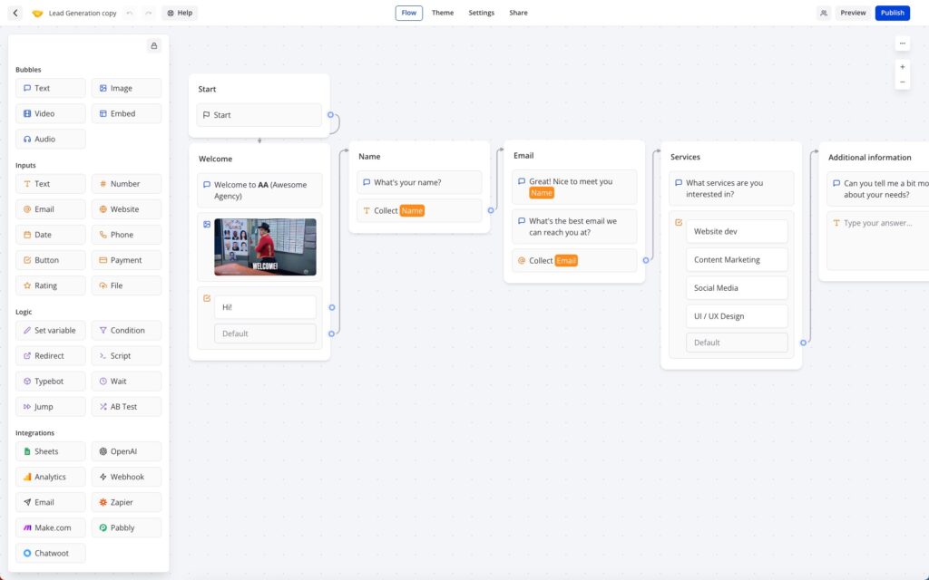
Typebot is a free and open-source platform that lets you create conversational apps and forms, which can be embedded anywhere on your website or mobile apps.
It provides various features like text, image, and video bubble messages, input fields for various data types, native integrations, conditional branching, URL redirections, beautiful animations, and customizable themes.
You can embed it as a container, popup, or chat bubble with the native JS library and get in-depth analytics of the results in real-time.
Typebot can be used in the Cloud (free tier available) or installed via Docker.
It drag & drop builder makes it amazingly fast to build your personal chatbot. It provides a ton of integrations (Google Analytics, Google Sheets, OpenAI, Zapier, Webhooks, Email, Chatwood) out of the box or you can connect other things via your own API Requests.
I have been a longtime user of RocketChat and build my own chatbots using Hubot or BotPress.
RocketChat
„Rocket.Chat is a free and open-source team chat platform that enables real-time communication between team members. It provides team messaging, audio and video conferencing, screen sharing, file sharing, and other collaboration features. It offers a familiar chat interface that makes it easy for teams to stay connected and collaborate effectively.
Rocket.Chat is highly customizable and extensible, with a large number of community-contributed plugins and integrations. It supports multiple platforms, including web, desktop, and mobile, making it accessible to teams regardless of their device or location. It also offers end-to-end encryption for secure communication, and compliance with various industry regulations such as HIPAA, GDPR, and others.“
Hubot
„Hubot is a popular open-source chatbot framework developed by GitHub. It allows developers to build and deploy custom chatbots that can automate tasks, integrate with various APIs, and enhance team communication and collaboration.
Hubot is built on Node.js and can be extended with various plugins and scripts, making it highly customizable and flexible. It comes with many built-in plugins, including integration with popular chat platforms like Slack, HipChat, and Campfire, as well as various APIs like Twitter, GitHub, and Google.
Hubot enables developers to build chatbots that can perform various tasks, such as scheduling meetings, deploying code, fetching data, and responding to user queries. It also provides a command-line interface for managing and interacting with the chatbot.“
Botpress
„Botpress is an open-source platform that allows you to build and deploy chatbots and conversational interfaces. It provides a user-friendly interface and a visual flow editor that allows you to create and manage your chatbot’s conversation flow. Botpress comes with many pre-built components and integrations, including natural language processing (NLP) engines, chat widgets, and webhooks, making it easy to build complex chatbots with advanced functionality.
Botpress offers features like machine learning-based NLP, conversational analytics, multi-language support, customizable themes, and a modular architecture that allows you to add custom functionalities with ease. It supports multiple channels, including web, Facebook Messenger, Slack, and WhatsApp, allowing you to reach your audience wherever they are.“
Typebot beats Botpress and could be the reason why I might be skipping RocketChat as well. Not sure I want to build an integration for RocketChat myself.
Base YAML Docker-Compose File to get you started. This will setup a Postgres instance, the typebot builder and typebot viewer.
|
1 2 3 4 5 6 7 8 9 10 11 12 13 14 15 16 17 18 19 20 21 22 23 24 25 26 27 28 29 30 31 32 33 34 35 36 37 38 |
version: '3.3' services: typebot-db: image: postgres:13 restart: always volumes: - db_data:/var/lib/postgresql/data environment: - POSTGRES_DB=typebot - POSTGRES_PASSWORD=typebot typebot-builder: image: baptistearno/typebot-builder:latest restart: always depends_on: - typebot-db ports: - '8080:3000' extra_hosts: - 'host.docker.internal:host-gateway' # See https://docs.typebot.io/self-hosting/configuration for more configuration options environment: - DATABASE_URL=postgresql://postgres:typebot@typebot-db:5432/typebot - NEXTAUTH_URL=<your-builder-url> - NEXT_PUBLIC_VIEWER_URL=<your-viewer-url> - ENCRYPTION_SECRET=<your-encryption-secret> - ADMIN_EMAIL=<your-admin-email> typebot-viewer: image: baptistearno/typebot-viewer:latest restart: always ports: - '8081:3000' # See https://docs.typebot.io/self-hosting/configuration for more configuration options environment: - DATABASE_URL=postgresql://postgres:typebot@typebot-db:5432/typebot - NEXT_PUBLIC_VIEWER_URL=<your-viewer-url> - ENCRYPTION_SECRET=<your-encryption-secret> volumes: db_data: |

A while back a potential customer asked me, if it is possible to restructure a WordPress Multisite setup and WPML with a more simplified and custom url structure?
web.site/de/
web.site/en/
Languages would normally be added like this:
web.site/nl-nl/de/
web.site/nl-nl/en/
The customer wanted it to be restructured / simplified like this:
web.site/de-nl/
web.site/en-nl/
This basically mimics the structure of a single WPML website with custom languages, but with all the benefits of a multisite.
This is nothing that WPML or WordPress Multisite provides out of the box.
I built a prototype setup to make it work.
Not something that I would propose for anyone, as it requires a lot of tweaks for anything that handles dynamic links (plugins, hooks, core systems, page.builder …)
Its doable :)
One thing that needs to be tweaked globally, is the mapping of the new url structure.
So web.site/nl-nl/en/ needs to become web.site/en-nl/
This needs to be handled on the server side, by proxying the original to the new structure.
This can be easily done using Apache or NGINX.
With that web.site/nl-nl/en/ will be proxied to web.site/en-nl/, but any core navigation will not work yet.
This is the fastest solution that I came up with, within the hour I gave myself ;)
There surely are other options, like the core rewrites / restructuring of the core shorturl handling. But these approaches might break things in far more areas.
Using the proxy approach, keeps the core as it is. The solution needs to be as simple as possible, allowing to maintain it in the future :)
Just for the basic setup a couple of hooks are required to make this work, more might be needed depending on the plugins in use.
Here a couple of examples ….
WordPress site_url
|
1 2 3 4 5 6 7 8 9 |
add_filter( 'site_url', 'custom_site_url' ); function custom_site_url( $url ) { if( is_admin() ) // you probably don't want this in admin side return $url; return str_replace( "/nl-nl/en/","/en-nl/", $url); } |
WordPress Nav Links
|
1 2 3 4 5 6 7 8 9 10 11 12 13 14 |
add_filter( 'post_link', 'changePermalinks', 10, 3); add_filter( 'page_link', 'changePermalinks', 10, 3); add_filter( 'post_type_link', 'changePermalinks', 10, 3); add_filter( 'category_link', 'changePermalinks', 11, 3); add_filter( 'tag_link', 'changePermalinks', 10, 3); add_filter( 'author_link', 'changePermalinks', 11, 3); add_filter( 'day_link', 'changePermalinks', 11, 3); add_filter( 'month_link','changePermalinks', 11, 3); add_filter( 'year_link', 'changePermalinks', 11, 3); function changePermalinks( $url, $post, $leavename=false ) { $url = str_replace("/nl-nl/en/","/en-nl/", $url); return $url; } |
WPML
|
1 2 3 4 5 6 7 8 9 10 11 12 13 14 15 |
add_filter( 'icl_ls_languages', 'wpml_url_fix'); function wpml_url_fix( $languages ) { global $wpml_url_converter; $abs_home = $wpml_url_converter->get_abs_home(); foreach( $languages as $lang => $element ){ $languages[$lang]['url'] = str_replace( "/nl-nl/en/","/en-nl/", $languages[$lang]['url'] ); } return $languages; } |
Rankmath
|
1 2 3 |
add_filter( 'rank_math/frontend/canonical', function( $canonical ) { return str_replace( "/nl-nl/en/","/en-nl/", $canonical); }); |
This will not cover every angle, but will give you a starting point! I love my puzzles and there always is a viable solution :)
Need something similar … get in touch!

Ich hatte dieses Jahr die Möglichkeit, über meinen Kunden TYPEMYKNIFE®, an der „Nacht der Sterne“ in Stuttgart, im Mercedes-Benz Museum, teilzunehmen. Auf der Gala kommen mehr als 800 Gäste aus Gastronomie, Hotellerie, Politik, Kultur und Wirtschaft zusammen.
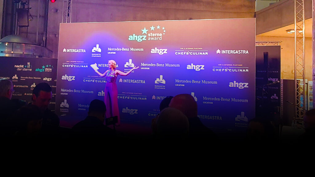
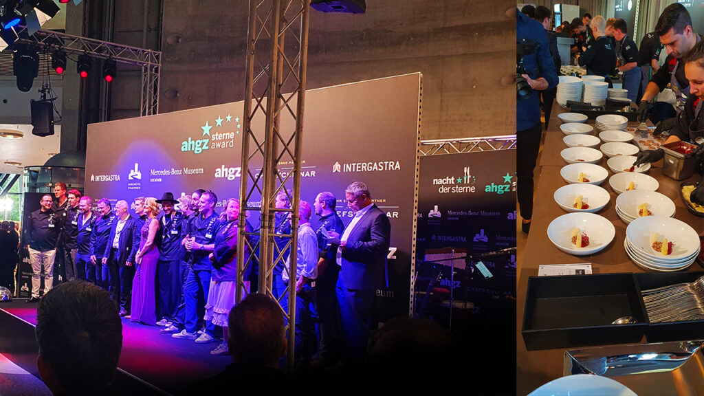
Es war ein klasse Abend, auf dem nicht nur die Spitzenköche aus Deutschland, der Schweiz, Südtirol und Österreich ausgezeichnet wurden, sondern diese auch Live zeigen konnten was sie so können.
Veranstaltet wird die Party von der Allgemeinen Hotel- und Gastronomie-Zeitung (Ahgz) und Burg Staufeneck / Rolf Straubinger.
Moderatorin des Abends waren die Journalistin und Fernsehköchin Felicitas Then und Rolf Westermann von der ahgz-Chefredaktion.
Informationen zum Award, den Methoden und Siegern findet man hier.
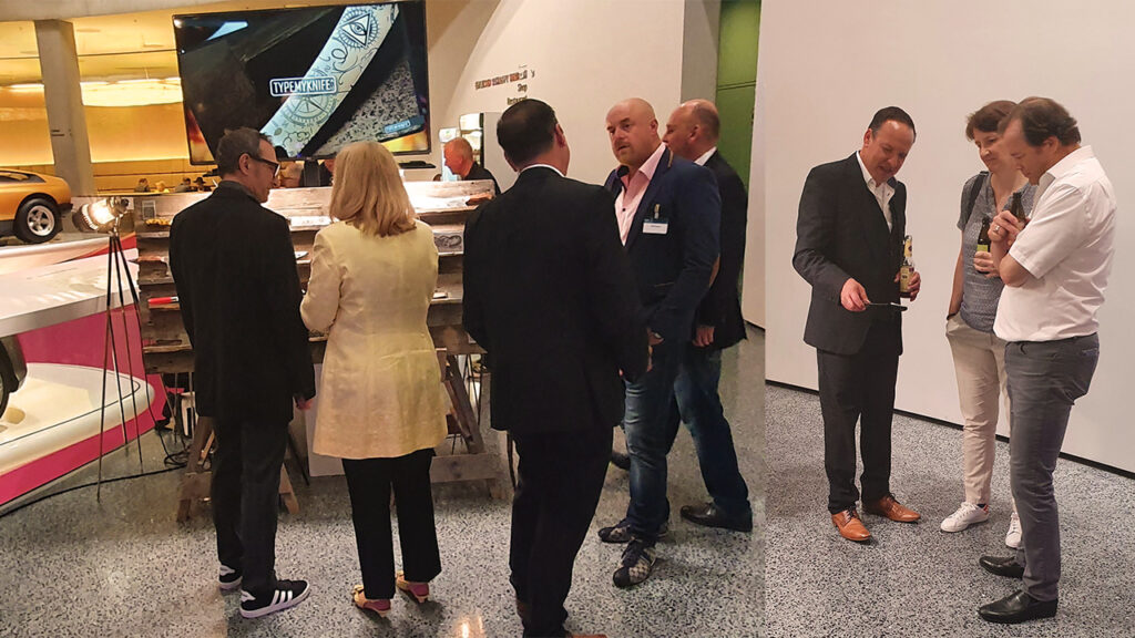

TYPEMYKNIFE® hat Vorort an einem Stand eine kleine Auswahl seiner Küchenmesser, die über den 3D Gravur Konfigurator vorbereitet und graviert wurden, präsentiert. Dadurch hatten Gäste die Möglichkeit, die gravierten Küchenmesser einmal persönlich zu entdecken und die Qualität zu bestaunen.

Die fast 1400 km Rundreise aus dem Norden hat sich gelohnt. Es ist immer schön Kunden mal nicht nur virtuell zu treffen, besonders wenn die Distanz so groß ist. Bei der Entfernung trifft man sich nicht immer mal kurz auf einen Kaffee oder Gin-Tonic :)
Gruß an TYPEMYKNIFE® / Schwäbisch Gmünd / Stuttgart

Somehow the Grids Layout Builder for Gutenberg ist not pushing styles to the footer within a Timber theme. At least not for me.
Somehow the wp_footer action within the Grids plugin is not being executed and no grid styles are added to the footer. I am not getting any errors, but will have to investigate some more in the near future ;)
Update: It is related to the get_footer action within Grids. get_footer is used to load the appropriate footer template file, which I am not using in my Timber theme ;) So the workaround below is perfect.
Here a quick workaround for the theme functions.php, that does the trick for now.
|
1 2 3 4 5 |
add_action( 'wp_footer', function(){ if(class_exists('Grids\Core')){ echo Grids\Core::instance()->styles(); } }, 100 ); |
„A layout builder is a tool that helps you creating visual structures in your page, from a simple layout made by adjacent columns, to more complex compositions.
Grids is entirely based on the WordPress block editor, which means that you’ll be able to use it together with the myriad of content blocks that developers and designers from all around the World are creating.
With Grids, we’re bringing a visual structure to the content written with the WordPress Block Editor.“
Grids: Layout builder for WordPress / Documentation / CSS-Tricks Article / A Complete Guide to Grid
This is using the Grids Plugin and only took a couple of minutes! I am so glad IE 11 is soon completely unsupported ;) and we can start using CSS Grid freely. Well we can, as nobody should be using IE 11 anymore!!!
On mobile its just stacked rows :)
COLUMN 1
I love to solve puzzles and find epic solutions :)
CSS Grid Layout excels at dividing a page into major regions or defining the relationship in terms of size, position, and layer, between parts of a control built from HTML primitives.
Like tables, grid layout enables an author to align elements into columns and rows. However, many more layouts are either possible or easier with CSS grid than they were with tables.
COLUMN 2
We all love magazine-style layouts and we are getting closer to getting that :) The magic is in the detail.
For example, a grid container’s child elements could position themselves so they actually overlap another layer, similar to CSS positioned elements.
FLEX OR GRID
The basic difference between CSS Grid Layout and CSS Flexbox Layout is that flexbox was designed for layout in one dimension – either a row or a column.
Grid was designed for two-dimensional layout – rows, and columns at the same time.
COLUMN 3
I only styled the Desktop size, as a little preview. Added Custom CSS to switch areas for tablet sizes.
Unidentified vessel travelling at sub warp speed, bearing 235.7. Fluctuations in energy readings from it, Captain. All transporters off. A strange set-up, but I’d say the graviton generator is depolarized.
The dark colourings of the scrapes are the leavings of natural rubber, a type of non-conductive sole used by researchers experimenting with electricity. The molecules must have been partly de-phased by the anyon beam.
Lucas ipsum dolor sit amet c-3po solo bothan qui-gon darth solo darth dantooine dagobah mustafar. Fett solo yoda r2-d2 kit obi-wan hutt amidala kenobi. Jade leia gonk lobot ahsoka darth jade skywalker organa. Utapau mara owen darth darth yavin.
Lando baba wedge darth solo skywalker ben fett. Fisto wookiee bothan antilles antilles luke kenobi. Yavin naboo kenobi jinn calamari antilles. Organa jabba skywalker gamorrean ackbar. Windu skywalker kit skywalker. Dantooine dantooine moff leia dantooine wicket amidala.
This is almost a perfect Gutenberg plugin and a reduced / simplified integration of CSS grid. I really think that this plugin makes Gutenberg 1000times better.
There is so much repetition of Gutenberg blocks out there, while this really addresses something new and nails it :)
There are still things missing, that are critical and would make this even more useful for certain websites:

WACOM is known for stopping support for their pen tablets after some years, especially for the cheaper consumer pen tablets.
The WACOM Bamboo (in my case the CTH-461) is a pretty popular pen tablet and the latest driver wont install natively under Windows 10. Really frustrating for hardware that is still in perfect shape.