

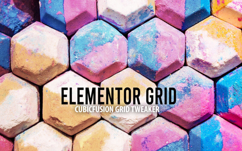
Elementor Pro provides grid containers as an experimental feature. The options provided are limited, when it comes to native controls. The fine-tuning of the grid container items need to be done using Advanced CSS.
If you are looking for a simpler way without using Advanced CSS, I started building out a Grid Tweaker for Elementor.


This will add a new tab to all containers and allows you to tweak grid-row / grid-column. Basic work is done. I am currently tweaking the controls a bit and will make it even easier ;)
Added an example template to import into Elementor. For those interested, the plugin can be freely downloaded from my Github repository. You can also do a search for „cubicfusion-grid-tweaker“ on Github.
Cheers and enjoy
Alex

I had the chance this year to meetup with my client Thomas Dowson from „Archaeology Travel Media“ at the Travel Innovation Summit in Seville.
Over the past 2 years we have been revamping all the content from archaeology-travel.com and integrated a sophisticated travel itinerary builder system into the mix. We are almost feature complete and are currently fine-tuning the system. New explorers are welcome to signup and testdrive our set of unique features.
It was so nice to finally meet the whole team in person and celebrate what we have accomplished together so far.
Directly taken from the front-page :)
„EXPLORE THE WORLD’S PASTS WITH ARCHAEOLOGY TRAVEL GUIDES, CRAFTED BY EXPERIENCED ARCHAEOLOGISTS & HISTORIANS
Whatever your preferred style of travel, budget or luxury, backpacker or hand luggage only, slow or adventure, if you are interested in archaeology, history and art this is an online travel guide just for you.
Here you will find ideas for where to go, what sites, monuments, museums and art galleries to see, as well as information and tips on how to get there and what tickets to buy.
Our destination and thematic guides are designed to assist you to find and/or create adventures in archaeology and history that suit you, be it a bucket list trip or visiting a hidden gem nearby.“
More Details
About
Mission & Vision
Code of Ethics
We are constantly expanding our set of curated destinations, locations and POIs. Our plan is it, to make it even easier to find unique places for your next travel experience.
We are also working on partnerships to enhance travel options and offer a even broader variety of additional content.
Looking forward to all the things to come, as well as to the continued exceptional collaboration between all team members.

Somehow the Grids Layout Builder for Gutenberg ist not pushing styles to the footer within a Timber theme. At least not for me.
Somehow the wp_footer action within the Grids plugin is not being executed and no grid styles are added to the footer. I am not getting any errors, but will have to investigate some more in the near future ;)
Update: It is related to the get_footer action within Grids. get_footer is used to load the appropriate footer template file, which I am not using in my Timber theme ;) So the workaround below is perfect.
Here a quick workaround for the theme functions.php, that does the trick for now.
|
1 2 3 4 5 |
add_action( 'wp_footer', function(){ if(class_exists('Grids\Core')){ echo Grids\Core::instance()->styles(); } }, 100 ); |
„A layout builder is a tool that helps you creating visual structures in your page, from a simple layout made by adjacent columns, to more complex compositions.
Grids is entirely based on the WordPress block editor, which means that you’ll be able to use it together with the myriad of content blocks that developers and designers from all around the World are creating.
With Grids, we’re bringing a visual structure to the content written with the WordPress Block Editor.“
Grids: Layout builder for WordPress / Documentation / CSS-Tricks Article / A Complete Guide to Grid
This is using the Grids Plugin and only took a couple of minutes! I am so glad IE 11 is soon completely unsupported ;) and we can start using CSS Grid freely. Well we can, as nobody should be using IE 11 anymore!!!
On mobile its just stacked rows :)
COLUMN 1
I love to solve puzzles and find epic solutions :)
CSS Grid Layout excels at dividing a page into major regions or defining the relationship in terms of size, position, and layer, between parts of a control built from HTML primitives.
Like tables, grid layout enables an author to align elements into columns and rows. However, many more layouts are either possible or easier with CSS grid than they were with tables.
COLUMN 2
We all love magazine-style layouts and we are getting closer to getting that :) The magic is in the detail.
For example, a grid container’s child elements could position themselves so they actually overlap another layer, similar to CSS positioned elements.
FLEX OR GRID
The basic difference between CSS Grid Layout and CSS Flexbox Layout is that flexbox was designed for layout in one dimension – either a row or a column.
Grid was designed for two-dimensional layout – rows, and columns at the same time.
COLUMN 3
I only styled the Desktop size, as a little preview. Added Custom CSS to switch areas for tablet sizes.
Unidentified vessel travelling at sub warp speed, bearing 235.7. Fluctuations in energy readings from it, Captain. All transporters off. A strange set-up, but I’d say the graviton generator is depolarized.
The dark colourings of the scrapes are the leavings of natural rubber, a type of non-conductive sole used by researchers experimenting with electricity. The molecules must have been partly de-phased by the anyon beam.
Lucas ipsum dolor sit amet c-3po solo bothan qui-gon darth solo darth dantooine dagobah mustafar. Fett solo yoda r2-d2 kit obi-wan hutt amidala kenobi. Jade leia gonk lobot ahsoka darth jade skywalker organa. Utapau mara owen darth darth yavin.
Lando baba wedge darth solo skywalker ben fett. Fisto wookiee bothan antilles antilles luke kenobi. Yavin naboo kenobi jinn calamari antilles. Organa jabba skywalker gamorrean ackbar. Windu skywalker kit skywalker. Dantooine dantooine moff leia dantooine wicket amidala.
This is almost a perfect Gutenberg plugin and a reduced / simplified integration of CSS grid. I really think that this plugin makes Gutenberg 1000times better.
There is so much repetition of Gutenberg blocks out there, while this really addresses something new and nails it :)
There are still things missing, that are critical and would make this even more useful for certain websites: